For my nail varnish brief I've decided a good starting point would be to research cosmetic packaging design as the packaging is definitely something that will form much of the basis for my brief.
Gaba Guzik - Graphic Designer based in Poland.
I really like this packaging due to the intracate papercut design because a simple detail such as this seems to add value to what ever is packaged within it. I think the white and gold together also add to this idea of a value product because they are two very clean, sophisticate colours. Although I really like the idea, I wonder if there is too much packaging here and would it be better to just utilise the papercut method and not the box in the middle. However, beauty products are nutorious for having a little too much pacakging. A simple finishing method such as this could easily be applied to the size and shape of packaging that I am considering. It could also give my product the afforable quality I'd like it to have because this is a simple method.
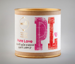
Bratislav Milenkovic - Illustrator based in Serbia.
I like this packaging because it's bright, bold, sophisticated and looks like something I would purchase if I found it in a store. I'm not usually the biggest fan of typography based products but I feel this is more appealing because its also illustrative in its own way with the methods applied to the larger letters and textures. The materials used appear very durable which is something that makes you think the product inside is of high quality or could be breakable. Although these materials aren't really suited to the area of the industry I am looking at, I feel I could apply different ones if I wanted to create a similar type of packaging. The overall packaging design itself is really simple, I think the effectiveness of the graphic design is what makes this most appealing.
Kathryn Hopkins based in the USA.
I thought this was a really good example of how a logo could be applied across a full beauty cosmetics range and adapt to different shaped products. The logo itself has also given me a further insight into what actually makes a good looking beauty brand. So far I've seen that many of them use a really simplistic typeface, sometimes plain and other times quite stylised, the majority of the time theres no imagery involved. This example of branding in particular has a balance between high end and middle because the way in which the layout has been executed speaks high end and the logo is a bit more fun than high end products usually are. This inspires the elements I am considering because I want to try and create this balance.
This is one of my favourite pieces of cosmetic packaging that I've found so far. I really like the fact that it incases the nail varnish bottle within one half of the packaging and in a sense showcases it. The fact this piece is a bottom and lid type of packaging seem to give the impression that the product inside is high end and it may encourage consumers to buy it if they have an interest in packaging. This type of packaging will only work for me depending on the type of bottle I decide to go for. Due to the fact I am however considering creating packaged collections, that might really well like this.
I really like this packaging because it's some of the more simple designs I have looked at within the beauty industry. I think the fact it has a brand applied to it makes a simple design like this work because people buy into the brand and not the packaging itself. I can image this working really nicely for nail varnish packaging because it's really small and neat. As it hides the product inside this could be seen as an issue as consumers like to view the product but there are ways that the packaging can be adapted.


No comments:
Post a Comment