


http://www.behance.net
Eri Liougkou - Graphic Designer based in Greece.
With my own pakcaging for the Fudge Kitchen brief I was wanting to explore this idea of using a wrapping when the fudge product is bought in order to conceal the quality and also apply some sort of revelent design to this. I found this example which I really like due to the simple design and the fact the packaging itself is really quite minimal for the product. Products such as this are showing me that sometimes less is more with high-end and quality products so this is something to consider when creating my own packaging.

Jennifer Ybarra - Designer based in the USA.
This isn't actually specifically food packaging but is actually an envelope created for a food company as part of a stationery range. This however intially inspired me in the sense that the fudge could be packaged in some kind of envelope design with the logo simply applied so that instead of wrapping the fudge, it would be protected by the envelope. After considering this particular design concept more, it's probably not suitable for the fudge because it could get sqaushed so the packaging wouldn't really be doing it's job. I still really like this design despite this.


David Brier - Design and brand identity specialist based in the USA.
I really like this packaging design for cookies because the packaging doesn't utilise more material than it has to and it's a simple yet different way in which to package a food product because the shape is a little more interesting than your typical box. The fact the packaging design can be altered easily depending on the flavour of the product is another good design feature becausr the design itself is visually engaging but not too busy. The great thing about a packaging design such as this is that a range of different stocks could be used to create it so there is room for experimentation if I decided to utilise something similar.


Emi Knight - Graphic Designer based in the USA.
I was drawn to this box design because the designer appears to have taken the traditional box shape and just altered the net so that the bottom is rounded. Although this is a really basic change, it makes the world of difference because the box now appears a lot more visually interesting and may even add quality to a product because it's different. With my own designs I could stick with a really simple traditional packaging idea and just tailor it slightly like this in order to create something unique to my product.


Nicholas Weltyk - Designer and Illustrator based in the USA.
I really like this particular packaging design because not only has the designer created packaging for a product but they've designed two products in one. The fact that the packaging is also the carrier is quite a clever idea because for a product it would reduce the cost of packaging because you would obviously not need the two seperate products. Despite this being a really successful idea, I don't think the exact design above is relevent to a food product but something similar could be adapted.


Jennifer Swales - Graphic Design student based in Peterbrough.
This is again, another piece of design I liked for the simplicity. I think adding a belly band to something, if it is designed well, defintiely adds to the quality of the product because it makes the packaging appear more fancy in a way. If the simple box design was to be utilised this has also made me think about what can be added to such a design in order to increase the quality. Things like cut out windows, belly bands, ribbon etc tend to do this but only if they are executed well.


Brittany Hayes - Graphic Design student based in the USA.
This is another example of how wrapping a product can be utilised. A simple repeat pattern shape design works really successfully as long as it is applied to other products within the brand so that everything links together. Using specific colours that relate to the brand would also help with this and a simple sticker design to hold it all together makes even the simplest of products 'high end'. This particular design shows that if something is packaged well, it can change the whole view of the product.


Eben Keun and Lexi Monzeglio (Breinstorm Brand Architects) based in South Africa.
This is one of my favourite pieces of packaging design i've come across so far. The shape when the whole thing is tied together is visually interesting and sophsticated and then when it is taken apart it can be easily thrown away (as most confectionary packaging is) because it folds flat. Theres quite a lot of space to be filled with design but this doesn't need to be overpowering because simple seems to communicate best. The other great thing about this packaging design is that I imagine it will be easily adaptable for a range of sizes which is something I definitely need to consider within my own product range. Stock considerations are also not too limited with a packaging design like this.


Karolina Radzimirska - Graphic Design student based in Poland.
I really like this packaging design because its different to a lot of others I have looked at. It looks like it would be really durable to a certain point so would definitely protect the product within it. The concept behind it is really simple and is another design that can be easily adapted amoung sizes. This would create quite a nice packaging piece for the particular products I am exploring because the jars of fudge sauce would fit in there but also the fudge itself would because i'm already aware of the shape once it is cut. Some nice print finishes would make this design appear really high end so it's definitely one to be considered.
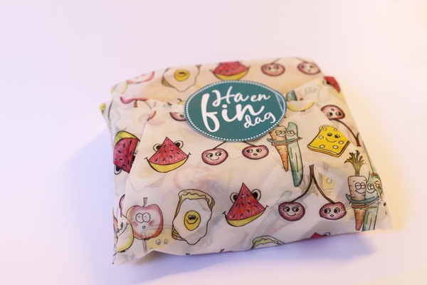
Charlotte Olsen, Kristine Heggland Vigsnes, Kristian Mauseth and Linn Cathrine Haland Nilsen based in Norway.
This is again looking at the wrapping for products and how designs can be applied. Although I really like this design because its visually engaging and the illustrations are quite sweet, I think the simple polka dot repeat pattern I looked at previously was a lot more successful because it's a lot easier on the eye and the colours seem to have come out a lot better but this could just be down to the stock or the printer. I definitely think the idea of wrapping is something to experiment with, with my own product range depending on the type of packaging I go for.


d.studio - Branding, packaging and website design agency based in London.
This is one of my favourite series of packaging design that I've come across via doing this research and it's even more convieniant that it's fudge packaging. It's very similar to the biscuit packaging I've looked at above but the design direction is completely different. I was drawn to this packaging because of the bright and bold colouring and also the hand rendered approach to the text and imagery because these are both things I enjoy personally. I really like the fact that although the packaging designs are completely different in terms of the image, they still work really well together as a set. Although the actual illustration approach appears quite child like, the foil blocked, sophisticated logo brings the design back out to a larger target audience. I'd actually buy this product simply to keep the packaging due to the design quality and consideration.
No comments:
Post a Comment