Thursday 21 March 2013

Emily Ward Branding; favourite images.


After editing these photos and upon closer inspection, I'm not all that impressed with them because I seem to have got shadows in weird places on the images and the background isn't consistent throughout the images so this isn't going to look very professional. The actual products themselves photograph really strongly however, due to their bold colouring. I'm going to reshoot these products when I next book out the studio. 

YCN UK Greetings; favourite images.


These are my favourite images from the YCN brief photos that I will take forward to use on my boards. 

YCN UK Greetings and Emily Ward Branding; photoshoot.


I managed to get both of these briefs print finished so booked out one of the photography studios and photographed the final outcomes so I could get on with making my boards. Although I had quite a small space to work with, I'm pretty happy with how these came out because it doesn't appear that I'll have to do much editiing to these other than maybe cropping them down. 

Wednesday 20 March 2013

Surface Pattern yearbook; meeting.

We had a meeting to discuss the yearbook progress today. 
We discussed the fact that you could have colour swatches for each of the 62 students for the cover design instead of a photograph. 
Ink pots could be used to make up these areas of colour. 
If we have 64 squares so 8x8 then this will include a square for each of the students, one for the course team and one for us as the yearbook team. 
There could be a spectrum of colours throughout.
Each student could have one shot of their work and then one shot of their studio space. 
We could utilise a square format inside the yearbook to link to the squares on the cover and the overall format of the yearbook. 
Helvetica seems like a good font to use for the copy of the yearbook

To do... 
Consider colour schemes - maybe have no sqaures on the back of the yearbook. 
Have a go at placing images (just placeholders for now) to see if we can come up with a good system for this. 
Sophie will send us a grid.
Theres bit's of copy still to come from Duncan.
Think about how the brief could be extended personally. 
Work on the layout as a whole and consider the amount of pages within the yearbook. 


Design context presentation.


This is my design context presentation so I can explain to everyone what I'm looking at and what I would like to produce. I'm hopefully going to present without notes... I should know what I'm talking about afterall! 

Tuesday 19 March 2013

Design context publication; Newspaper//layout consideration.


I've decided for my design context publication that I'm going to create a newspaper publication. The reason for doing this is because I want my publication to be very heavily image based because it is afterall, going to be about image. With a newspaper, there is a lot of space for images and some of the images can be quite big too if I find large enough files on websites etc. I'll have a lot of freedom with the layout in general with this format. I looked at some of the newspapers that other people have had printed with the newspaper club (which I am going to use to print) to get an idea of the sort of direction I could take my own publication. I'd like a mixture of images on the pages in order to keep the reader interested in the publication. I'm not going to be able to have a full double page spread unless I ask the artist for original artwork which could be a bit of a faf. I think I'm going to work to my own grid system so it's consistent and have as little text as possible. Maybe just a short explination about each section and obviously credit the relevent designers/illustrators. 

Design context publication; applied image.


Stephanie Swanson - Illustrator based in the USA. 

I found this illustrator around the time I was creating my own gift range. I really like this project because although theres so many different designs and colours, everything still links together due to the illustrators style. It's also applicable to my own practice via the elements that are image based. The type side of it is also quite interesting though because it's not too heavy so it's still something that I enjoy. 

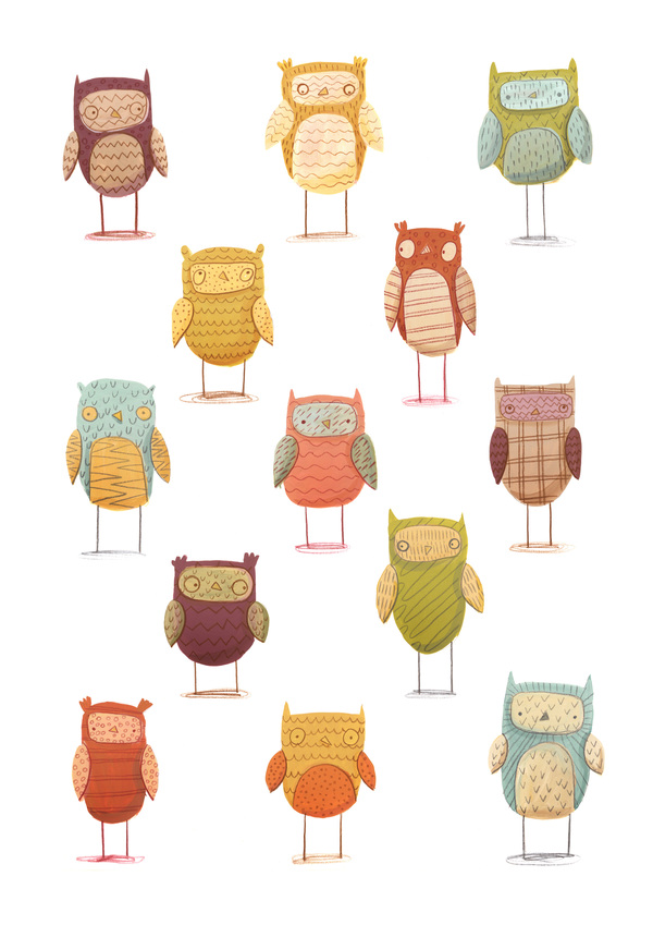
Martina Friedli - Graphic Designer and Illustrator based in Switzerland.

It was quite odd coming across this work because what drew me to it initially was the photography more than anything. The fact it has been photographed on wood rather than in the usual white background set up made me really interested. I think this approach works really well with the style of this project in particular because the designs remind me of wooden cabins in the hills and the outdoors. When I looked closer at the work too, I really like the style of illustration because it's quite detailed and the range is very different but works with consistency. 


Monika Filipina Trzpil - Children's book illustrator based in London.

I like these designs both for my love of repeat pattern and simple illustration appraoches. I quite like design that you can imagine being placed on a range of products but also that can just be enjoyed because it's visually pleasing. This also links to the work I'm currently doing with animals as the theme so it's was quite interesting to see how someone else interprets animals. 


Emma Carpendale - Illustrator based in Northampton. 

Again, photography set up drew me to these greetings cards but also the tools used to create the designs. I like the fact they are really simple but the use of colour means they don't look boring on a white background. These are the sort of cards I'd consider buying if I found them in a shop too because you are able to write a personal message inside. 

Pridumala - Pattern designer based in Russia. 

More surface pattern design, really simple design overall but the bold colours really make it have a high impact. As soon as I saw this, I wanted to know where I could get one. This designer is someone else who has made me consider further context's of where my own work could be placed because I generally don't think about the textile side of design. A lot of the pattern design found on the website very much has the same characteristics so this is someone else who I will continue to follow. 


Design context publication; studios.


Little Smilemakers

I originally found Little Smilemakers, made up of one designer, on instagram and then realised they have a blog. She is constantly updating/uploading work and the majority of the time I like everything I see. Due to my interest in pattern design some of these designs are the sort of things I aspire to if I choose to develop this skill. Following this blog has been quite good contextual research in general because It's made me aware of the sorts of products designs can be applied to if I hadn't thought about it before. The work is always really bright and exciting. It's also always really different although based around the same concept.


Monday 18 March 2013

Surface Pattern yearbook; meeting.

We had another meeting to discuss the current progress on the yearbook.
On the 22nd April we need the top three pieces of work from each student to photograph in the photoshoot we are setting up.
We're going to take some shots in printed textiles tomorrow at 10AM for cover ideas.
We need to focus on the studio images as this is really important to the course.
Marbelling could be used for the end pages and quotes to make these stand out.
'The Journey' could be on the front and then 'Is the destination' on the inside page because the yearbook is mainly the journey.
Colours in photographs could determine others used in the yearbook
Marbelling ink is £1 - £2 a bottle

To do...
Choose favourite photographs from studio by wednesday

Next meeting is Wednesday afternoon

Geek Table; crit three.

We had the third Geek Table crit to discuss the alter ego brief and the guilty pleasure one at the same time as we set these briefs to be done for the same deadline. I got no specific feedback on the guilty pleasure brief because this was straight forward type and everyone understood this straight away. In terms of the alter ego brief it was suggested that I add me dressed as a farmer because this is my alter ego and at the moment it's not represented as well as it could be through just the image of a pig. The other piece of feedback I got with this was to consider changing the format once I produce more imagery because it might work differently once it has been added to. I definitely want to go back and develop both of these briefs so they exploit my skills fully because I feel if anything, these two were a little bit rushed. 

Design context publication; hand rendered.

Alex Konahin - Artist based in the Netherlands. 
http://www.behance.net

This was a one off piece that I quite liked from this artist due to the detail that has gone into this. Again linking to my own practice due to the hand rendered nature I can really appreciate how much time must have gone into something like this. It's amazing how neat the whole drawing is too and in a way I some what envy the skill this artist has but hope to get my own up to scratch and this sort of standard!

 Georgina Luck - Illustrator based in Brighton.                
http://www.behance.net

Another appreciation for hand rendered design, I liked this because I've not really seen anything similar and although the style is quite straight forward, it's visually interesting. I quite like the fact it has a sort of rough approach to the illustration too because the one characteristic I like about hand rendering is the fact it doesn't have to be perfect. It has more character like this. 


Design context publication; graphic art.


 Mitchell Nelson - Illustrator and designer based in Bristol. 
http://www.behance.net
http://cargocollective.com/mjnarts

I really like this particular set of images from this freelancer because it's very true to the sort of work I like to produce personally using different tools. The other thing I liked about this is that although it has an obvious purpose with the Starbucks logo, it's also something that could just be enjoyed in a graphic art sense. The depth the images have is definitely a further thing that makes them visually interesting. 

Benjamin Flouw - Colour Artist based in France.
Although Benjamin hasn't really produced a lot of design based work, the few pieces he has I really like due to their fun and friendly nature. I quite like the style he has utilised in terms of everything appearing to have a texture, it almost makes the characters look 3D and a bit more life like. The style he has adapted makes so much difference because if there was no texture I don't think the characters would have the same impact. 


Design context publication; freelancers.


Mr Bingo

I'm familiar with Mr Bingo via the course and other people but really like his work because although it's digital, it still has an obvious hand rendered approach to it through development. Although the characters are quite cartoony, they almost appear life like in some way due to the style too so I thought that was quite cool. Mr Bingo has quite a vast portfolio of projects too so this was really interesting to look through and it's constantly being updated so it's someone I can follow properly. 

Design context publication; freelancers.


Andrew Denholm

I was really drawn to Andrew's work because it's heavily image based which is obviously something I have a keen interest in. I really like the fact that a lot of the colours he uses are very vibrant, this seems to be quite a consistent thing throughout. The use of pattern within image is also something that has drawn me to this work because I've really gotten into pattern design as well this year. It's made me think differently about how I can personally utilise this skill. 

Design context publication; freelancers.


Kate Forrester

The majority of Kate's work is based on crafting and papercut imagery/text. This is why I was quite drawn to her work because it's a unique style that has meant shes had big clients such as John Lewis. Looking at Kate's work, she's had quite a few different briefs to work on as well so it made her portfolio quite interesting to look through. I particularly like the chocolate work as the fact her design has been moulded into the chocolate because this is a really nice touch. 


Design context publication; studios.


Paul Windle

Paul Windle are someone else who I have followed for the past couple of years. I got really excited when I found out about them because they create artwork for some of my favourite disney characters and their work in general is of such a high quality. They are quite applicable to the sort of design I am producing now too because I've done a lot of character design and artwork based projects this year. Although a lot of my work is more hand rendered than their work appears, there's the link still because their character design starts from a hand rendered sketch. 

Design context publication; freelancers.

Chris Jevons

Chris is someone who I've spoken to a few times over the past couple of years in relation to PPD and making a new contact. I really like his work because he puts a unique twist on character design and his style is quite adaptable. He works within children's illustration which is also something I've become quite interested in recently so it's good to see what work other people are producing in terms of this market.