Thursday 28 February 2013

Emily Ward Branding; test print.

I ordered some samples of some of the business card designs that Emily likes best from Moo in order to show her the quality that the business card will print out at and to see if she liked the design in print and not just on screen. 

Wednesday 27 February 2013

Emily Ward Branding; Rugby printer.


I already have an idea of a few printers that I've spoken to Emily about for her business cards but I asked the Geek Table if they knew of any others just incase I missed someone good! Claudia and Baljeet have both used Rugby printer and are impressed with the results. Claudia very kindly lent me her sample pack so I could take a few photos of the sorts of things the printers are able to do. They seem to have a lot of options in terms of business cards so this is really good and various different stock options are available too. I've heard they have good prices so that's another bonus. I know Emily is quite keen to have them done at Moo after showing her what they offer and my view on the quality of their prints but it's always good to have back up options and this may also come in handy in the future. 


Design context.


Ready for the design context group tutorial I decided to gather some of my favourite bits from the research I'd done so that I was able to show everyone the sorts of things I've been looking at. I'll admit, I hadn't really though much about the design context publication at this stage and the elements above all stem from my studio briefs I'm currently undergoing but they are also very relevent to the area of the industry that i'm particularly interested in. At this stage I've divided everything into categories based on what bits of research fit where but I imagine after the tutorial I will have a better understanding of exactly which direction I'd like to push my design context in. I think once I better understand this part of the module, I'll really start to enjoy it more. 

Design context publication; categories.

After the tutorial I felt so much better about this brief. Before hand I had an idea that the research I was already doing was relevent but I wasn't exactly sure what to do with this research and how I was going to focus my publication. Now I feel that I have a proper direction with this brief and I'm quite excited to get stuck in because I've really started to enjoy researching more this year. I've thought of my overall theme based on what I enjoy most about Graphic Design and also thought of how this could go into categories. This tutorial made me think more outside of the box because all my research so far has been linked to my briefs but the research for this brief needs to be bigger and I need to look for anything at all that I like, that fits into my categories and overall theme. 

My theme:  Image
Categories: Applied Image
                   Graphic Art
                   Hand Rendered
                   Branding
                   Packaging

With these categories in mind I can now go away and get really stuck into this brief. In the meantime I need to consider what format I would like the final piece to take. 

Design context tutorial.

I took a few notes in the design context tutorial so that I can refer back to them whenever I need to throughout producing my publication. 

- What inspires you? (Applied image)
- Contact studios or people for interviews (not mandatory) 
- In terms of format we could do, posters, a dvd, a website, a fold out booklet
- We need to think of this as a piece of design
- What is it about the subject I've chosen? Why have I chosen a certain image? 
- Need a rationale: what do I do? 
- Record, structure, understand
- Leave time for production if making something bespoke
- Credit the designers included in design context
- A PDF copy is required as well as a print one
- You can include you own work to show how context has inspired you but this should be more about the inspiration 
- We need no less than four categories/chapters

Emily Ward Branding; further development.


After sending Emily screenshots on the current progress of the brief she made some decisions about what she'd like on her business cards. Emily said she preferred her first name or full name as opposed to the signature after we discussion the minor implications of this. She also said she would like her name on the front and the back and really liked the idea of the name on the front being in colour in order to match some of the colouring within the imagery. I've altered one of the designs slightly with just 'Emily' on the front and this is the orange one, I've taken a brown colour from the image instead because this was the only one which was particularly hard to see with the colour orange applied. I'll show this change to Emily and see what she thinks. Originally I'd only applied the colour idea to Emily's full name so i've also gone back and applied this to her first name in order for her to choose what she prefers properly. We've also discussed this week having some free samples printed before ordering a full set to make sure Emily likes the designs when they are sent to print and also just in case there are any problems with the design in general. I plan to meet up with Emily soon in order to take the design to the print stage. 

Tuesday 26 February 2013

Fudge Kitchen; current packaging.


Kirsty recently visited the Fudge Kitchen in York so gave me her packaging so that I could consider how I'm going to improve their existing packaging and the stocks I could use when creating my own and also the finishing I could use. 

YCN UK Greetings; animal illustration.

Here I was looking at how other designers and illustrators have approached illustrating animals to inspire me. 


Andreas Preis - Graphic Designer and Illustrator based in Germany.
These pieces really stood out to me due to the unique style that this designer has used. These are just three of many designs he has done with animals. I like the fact that they are almost mosaic like because within certain aspects of the animals they have a pattern. The style throughout all of these designs is consistent too because the designer has taken key aspects and applied this throughout each design. This is something I need to think about within my own practice when creating a range. 


Bioworkz - Graphic Artist and Illustrator based in the USA. 
I really like these illustrations because although the designer has used only black and white, the animals almost look as though they are coming to life due to the depth of the illustrations and the attention to detail. I particularly like the elephant for the fact the pattern within it really works and makes such a simple animal look so magestic. Dependant on the project, this set of illustrations in particular is proof that colour is not always best and design can still be as inspiring in black and white. 


Alejandro Giraldo - Graphic Designer and Illustrator based in Colombia. 
I really like this set of illustrations because the designer has taken well known animals but applied their own unique twist on this and in a way given them personalities. My favourite element about these pieces has to be the fact that the application of colour is very subtle but makes all the difference to the image. The fact all of the different characters have been put together also shows consistency in style. 

Daniel Teixeira - Illustrator and Designer based in Portugal. 
Throughout my research so far, owls seem to be consistant theme and it's been really good to see how different designers have utilised this because I am also going to be creating an owl greetings card design. I particularly like the image above because the focus is less about the actual animal within the picture and more about what can be done with it's characteristics such as the feathers. You can really see how this image may have built up and I think it's very effective despite being simplistic. It's making me consider the fact that sometimes it's better to think outside the box with illustration. 


Veronica De Fazio - Graphic Designer based in Argentina
This is another very good example of thinking outside the box because instead of this designer illustrating the literal animals, they have decided to use shape instead. This is very true to modern day design because everything seems to be quite minimal like this. I'm particularly drawn in by these designs due to the bright colouring and the fact they aren't particularly relevent to each animal in turn but you can see exactly what each animal is. The diamond shapes falling down throughout the image is a nice touch because it breaks each one up a bit too. 


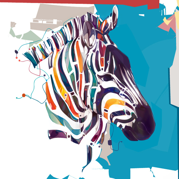
Dennis Gonchar based in Ukraine. 
More examples of minimal abstract design yet somehow these are very intricate at the same time. I was really impressed with these designs because they are completely unique to anything I've seen before. These are another series that appear to be made up of shapes but this time layered yet not as obvious unless you spend a lot of time taking them in. The random abstract backgrounds work really well here too because they fit well with the illustration style and compliment the animal wherever they have been utilised. 


MJ Da Luz - Graphic Designer and Illustrator based in Costa Rica. 
Going back to the opposite end of the scale and animals in a more literal sense. This has inspired me to consider how I can add my own twist to my illustrations. Is there something really small that ties them together? These illustrations all tie together via the fact they have an oversized head which is quite a quirky characteristic. When considering something like this I also need to think about who my target audience is going to be because to me these illustrations are aimed at a younger audience. 

Nail Varnish; Illamasqua.


I decided to look at Illamasqua cosmetics as they are a high end brand so I wanted to see what approach they took to their packaging and branding. The text part of the branding takes on quite a sophisticated font which is something I expect from this type of product. They however, have this interesting shape as part of their branding which I find quite interesting because it's unique. The branding says to me that they are targeting an older audience but this makes sense because the majority of consumers will be older as they will be able to afford to buy into such a product. I was really surprised by the packaging but this isn't neccessarily a bad thing. It's so simplistic and has a very minimal colour pallet however, the colour choices are what adds to this high end aura the product has. The way that the branding is applied to the products tend to be by using the symbol as the first thing you see but this works because those who buy it will recognise this. 


Nail Varnish; cosmetic packaging.

For my nail varnish brief I've decided a good starting point would be to research cosmetic packaging design as the packaging is definitely something that will form much of the basis for my brief. 


Gaba Guzik - Graphic Designer based in Poland. 
I really like this packaging due to the intracate papercut design because a simple detail such as this seems to add value to what ever is packaged within it. I think the white and gold together also add to this idea of a value product because they are two very clean, sophisticate colours. Although I really like the idea, I wonder if there is too much packaging here and would it be better to just utilise the papercut method and not the box in the middle. However, beauty products are nutorious for having a little too much pacakging. A simple finishing method such as this could easily be applied to the size and shape of packaging that I am considering. It could also give my product the afforable quality I'd like it to have because this is a simple method. 


Bratislav Milenkovic - Illustrator based in Serbia. 
I like this packaging because it's bright, bold, sophisticated and looks like something I would purchase if I found it in a store. I'm not usually the biggest fan of typography based products but I feel this is more appealing because its also illustrative in its own way with the methods applied to the larger letters and textures. The materials used appear very durable which is something that makes you think the product inside is of high quality or could be breakable. Although these materials aren't really suited to the area of the industry I am looking at, I feel I could apply different ones if I wanted to create a similar type of packaging. The overall packaging design itself is really simple, I think the effectiveness of the graphic design is what makes this most appealing. 


Kathryn Hopkins based in the USA.
I thought this was a really good example of how a logo could be applied across a full beauty cosmetics range and adapt to different shaped products. The logo itself has also given me a further insight into what actually makes a good looking beauty brand. So far I've seen that many of them use a really simplistic typeface, sometimes plain and other times quite stylised, the majority of the time theres no imagery involved. This example of branding in particular has a balance between high end and middle because the way in which the layout has been executed speaks high end and the logo is a bit more fun than high end products usually are. This inspires the elements I am considering because I want to try and create this balance. 

This is one of my favourite pieces of cosmetic packaging that I've found so far. I really like the fact that it incases the nail varnish bottle within one half of the packaging and in a sense showcases it. The fact this piece is a bottom and lid type of packaging seem to give the impression that the product inside is high end and it may encourage consumers to buy it if they have an interest in packaging. This type of packaging will only work for me depending on the type of bottle I decide to go for. Due to the fact I am however considering creating packaged collections, that might really well like this. 

I really like this packaging because it's some of the more simple designs I have looked at within the beauty industry. I think the fact it has a brand applied to it makes a simple design like this work because people buy into the brand and not the packaging itself. I can image this working really nicely for nail varnish packaging because it's really small and neat. As it hides the product inside this could be seen as an issue as consumers like to view the product but there are ways that the packaging can be adapted. 

YCN UK Greetings; illustration.

Here I'm looking at the different types of media I could use for my illustration and what works most effectively when edited digitally. 


Mattias Adolfsson - Illustration based in Sweden. 
This style of illustration is very similar to my own in the sense that the drawings are really simple with a black outline. The thing I liked most about this piece was that although the colouring is really simple, it has an element of depth to it with the way that it has been applied instead of being a block colour. The features on the characters are also really simple  which is something I utilise within my own design work too. 


Nicholas Kole - Illustrator and Character Designer. 
This is another set of illustrations I was really drawn to due to the application of colour and the fact the way it has been applied really brings the characters alive. Much like my own work, I also really like the fact that you can actually tell the illustrations are hand rendered and a lot of time has gone into them. I think hand rendered work like this is more personal to the illustrator. I particularly like the top image in the way that you can see a couple of stages the illustration has gone through with the line drawing and the application of colour because this really showcases the effect colour has on the work. 


Samantha Jones - Student based in South Africa. 
I was really drawn to this piece due to the use of bright bold colouring. The illustration part of this is what interestings me most and again I think a good choice of media has been applied because it almost makes the characters seem alive. The characters are meant to have a texture to them as this is what makes the whole piece more visually interesting as such a limited colour pallet has been used. I think the media is definitely what makes this piece so successful. 

Silvano Robles - Graphic Designer based in the USA. 
This is another type of illustration and again the overall look of the piece revolves around the way in which the colour was applied. Although I like this style because it creates bold pieces, I think because it doesn't have any depth to it as such, it doesn't really appeal to me as much. I do really like the fact that this piece doesn't really communicate anything as such and is just there to be enjoyed because the colours used make it visually appealing. 

Walker Ballantyne - Hill - Illustrator and Designer based in Canada. 
Another method of bringing illustrations to life is by applying shades of a particular coloured used in order to make this area appear more life like. Shading is another element that brings an image off the page and makes it more visually appealing. I really liked this piece because although the colours are quite bold and bright, they have a pastel characteristic to them which makes the overall piece appear professional. Although some of the colours contrast, they work really well together in the way in which they have been applied. 


Nicholas Mahlunge based in Brighton. 
These pieces really stood out to me because I personally like to draw everything with a black outline before adding colour or making it digital so they are definitely something I can relate to. I like the fact that line drawings like this don't always have to be completely perfect because if they are slightly imperfect then this seems to add more character to a piece. I also seem to have a big interest in pattern design at the moment so that's another reason why these pieces appeal to me.