Tuesday, 28 May 2013
Monday, 27 May 2013
FMP Notes.
Brief one, seven and four are all contained within the same submission box.
Design context, brief five and brief three are all contained within the same submission box.
Brief six is contained within the same folder as the submission boards.
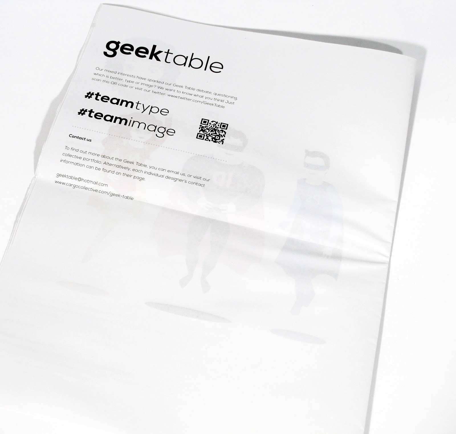
Geek Table; printed pieces.


Printed Geek Table final pieces.
The back of the postcards have the geek table logo and my geeky skill name so I can be distinguished from everyone else in the geek table but these pieces can still be linked to this particular brief and collective. I've duplexed the postcards so that they feel high quality. The great thing about them is they would be easy enough to post out and work well because people like to recieving something physical and tactile.
Saturday, 25 May 2013
Design Context Publication; bibliography.
This is the bibliography for all of the research into designers I did for my design context publication.
Geek Table; Reworked pieces.
I've been meaning to edit my Geek Table pieces based on the feedback I was given in our crits and I've finally gotten round to it! The pieces haven't changed massively in themselves but the context of them has. I decided to create postcards instead because the original purpose of having large scale prints was for the exhibition but obviously we aren't doing this anymore. The postcards can be used a promotional tool for my skill within the geek table as the overall brief is partly about promoting our skills. I think this format suits my pieces much better because when I drew the original artwork, I did this quite small so by having smaller outcomes, you don't lose any of the detail and they feel more apropriate. I'm going to print them onto watercolour card because this fits with the fact that my pieces are hand rendered.
Friday, 24 May 2013
Rewritten briefs.
As I've gone through the module some of my briefs have changed ever so slightly for various reasons. The main thing that has changed on many of them is the outcomes that I've created. The reason I've changed the outcomes has been because I felt with some briefs I was creating product for the sake of it when there was already a substantial amount so I've taken products out of the outcomes. These are my final written briefs.
Emily Ward Branding; presentation.

When I had my tutorial with Fred, he advised that I come up with a creative way of submitting the branding. I spoke to Emily about this to see if she could come up with anything that linked to her practice and she said what about framing it seeing as this links to being a curator. The frame itself is quite large but the overall idea works really well, especially the gold frame because this suits the colours of the images on the business cards.


Fudge Kitchen; photoshoot edits.


These are the edited photos for the Fudge Kitchen submission boards.
Fudge Kitchen; belly bands.
In the end when it came to actually printing the belly bands to go around the final pieces, I didn't like how they were looking so I ended up improvising and using some copper coloured ribbon to go around the sides of the box and then using the center of the belly band in the same format as the stickers I designed. This was a bit of a gamble at this stage but it actually worked so much better than I could have imagined. The images on the above post will show exactly what I mean in terms of this change!
Design Context Publication; printed newspaper.


My design context publication has arrived. I'm really happy with the overall result but knew I would be from the test prints that I did because these were to scale. The only issue I did have was that some of the images have come out pixelated. This is due to the fact that when they have been uploaded onto websites, they are obviously saved at screen resolution so there wasn't a lot I could do about this. Those that are pixelated aren't so bad that you can't see them though and the fact it's a newspaper has meant the ink may have bled a little to improve this in a way. The quality of the colour is obviously slightly altered too but this still looks good and I like the fact the overall publication is tactile and just a bit different to other elements that I have produced.
Thursday, 23 May 2013
Nail Varnish; point of sale.

To extend this brief and show the context of the product I created a point of sale stand. This has a really simple design but the relevent pieces of information stand out well enough for the brand to be recognised. The simplistic colouring of the point of sale means that the actual products stand out too because they are really bright and bold. The bottom left and right of the stand would be where the swatch booklets would be placed so consumers could just take one in passing. The back of the display would be lit up so that consumers would be drawn to it. The logo at the top of the stand would be mirrored in order to fit in with the fact the actual packaging is foiled. As the range of products grows, the point of sale would obviously alter. At this stage it would be as large as the others you find it places like boots that contain nail varnish and make up and would be located in the same place in store.
Fudge Kitchen; website.

As a further part of the overall brand I've mocked up an example of how the new website would look. I've kept the design really simple in order to fit with the rest of the brand and so that it would be easy to navigate around. The images on the website wouldn't actually be the packaging, they would be of the product to encourage people to buy into it but I've just used this as an example image for the purpose of my boards. I've taken elements off their original website that can be seen in the bottom left hand corner to do with food assosciations etc to make this look more realistic.
Fudge Kitchen; mocked up bag.

When I printed the original bag design it went a bit wrong in terms of where I had placed the logo and I was slowly running out of time so I decided to find and image off google and mock this up to show what it would look like to place on my boards.
Wednesday, 22 May 2013
Emily Ward branding; framed branding photoshoot.
Photoshoot of Emily's framed branding ready for submission.
Nail Varnish; photoshoot edits.
Edited images for my submission boards for the Nail Varnish project.
Tuesday, 21 May 2013
Nail Varnish; re-worked advertisements.
When it came to creating my boards for the submission of this brief I decided that the original advertisements I'd done didn't really fit in with the brand anymore as it seems to have developed throughout creating the other products. This was an easy fix because I went back and changed the logo on all of the adverts to match the grey on the rest of the products. I feel this works a lot better because it now has the high end appearance that all of the other products have and fits in.
Fudge Kitchen; uniform//shop front.
These are the final designs for the shop front and the uniform. The uniform is made up of a shirt, apron and hat. This is based on the existing uniform. The hat is quite traditional looking so this fits with the overall brand essence. The colours I've applied to the shirt and the apron would work really well together if the uniform was to actually be produced because theres not too much of either colour on either item.
Fudge Kitchen; staff uniform.

As part of the brand experience for this brief I've decided to do digital mock ups of the uniform too to match the new branding. The staff would wear a shirt to match the high quality of the brand and I came up with a few different colourways for this. I think I prefer the one with the brown and blue on the sleeves because these colours are much more complimentary to each other.
Fudge Kitchen; shop front.

I looked at the existing shop fronts for a few of the Fudge Kitchen shops around the country to base the layout the new branding on. I came up with two different ideas and then asked the geek table which they thought worked best. They said they prefer the one with the logo in the middle because this is more high impact so is more likely to be seen.
Monday, 20 May 2013
Fudge Kitchen; belly bands.

Based on the fact I've started utilising this shape on the labels and stickers I've also decided to apply it to the belly band design because this looks a lot better and means everything will link together as part of the brand. There are two different sizes of belly band depending on the size of the packaging. I've also made the sides of the belly band thinner because before it was covering quite a lot of space on the packaging.
Fudge Kitchen; drinking fudge labels//stickers.
I've created labels that will go on the front and the back of each of the drinking fudge pockets. This is another element where I have used different flavours to show how the colours would change so that the flavours can be distinguished from one another. The back of the labels include text stating how to use the products as well as all the ingredient information. I've also included the stickers in this document that would be used to hold the tissue paper around the product. These are really simple and just include the logo design. They wouldn't be foiled because they would just be thrown away so don't really need to be of that high a quality and still fit well with everything else. I've utilised this shape around the labels and stickers too because I feel it's better than just a rectangle and frames the logo really well.
Fudge Kitchen; sauce labels.
One of the other products the company sells is Fudge Sauce so I have created digital mock ups of the labels on the products to match the rest of the rebrand. I've used three different genuine flavours of the product to show how the colours of the text will change depending on the product. This is so that they can be distinguished if they are on a shelf. The label of the fudge sauce would be foiled where the logo is to add to the high quality aspect of the product. I've decided not to utilise the polka dot design on the label because this would make the text impossible to read and by using the colouring only this still links to the rest of the brand.
Fudge Kitchen; gift wrap//tissue paper.

To match the rest of the products I have designed tissue paper to wrap the actual product in. This would also be sealed with a sticker to keep the fudge well packaged.
Fudge Kitchen; gift bag.
The gift bag design is also based on a previous design that I've used in another project so I already knew that this net was going to work when it was printed. The bag would be available in two different sizes, medium and large to accommodate the products that consumers will buy. The design is based on the packaging so utilises the pattern on the inside and the logo and blue full bleed on the outside. To add a high quality finish the bag will be foiled and will have ribbon handles.
Fudge Kitchen; drinking fudge packaging.
For the acutal drinking fudge packets I decided to design this simple folding envelope design that would be fastened with a sticker of the logo. This idea didn't particularly take much development because I'd seen this online somewhere and had been inspired by it but tailored it to fit the brand colour/concept I'd come up with for my brief. I then took the fudge gift packaging net and made this slightly smaller to accommodate the envelopes. Although I probably should have done test prints for this, I based the size of the envelopes on the size of the box and worked all of this out properly so it should work when it comes to printing it. The main difference between this and the gift packaging will be that the belly band will state what the product is.
Design Context Publication; sent to print.

I've sent my publication off to print so that it would come back in time for the submission.
Sunday, 19 May 2013
Design Context Publication; test prints.

I did test prints of my design context publication before I sent it to print so I could check for typos and make sure the image quality was ok. There weren't any mistakes as such within this but I did decide to make the typeface smaller because it looks a bit overpowering on this.

This is the test print after I changed the point size. This works a lot better because it fits better in scale with everything else on the page.
Design Context Publication; PDF.
This is my final design context publication. Although I wasn't able to make some double page spread images due to the nature of sourcing images off the internet, I'm still really happy with the overall design because it seems to have consistency and I have a mixture of single images and multiples. The design of the actual publication is really simplistic because I wanted the images to speak more than anything else with this being the theme of the publication. There is also a minimal amount of text within the publication with the theme being image but I wanted to explain the reasons for choosing each section of my publication. My reasoning for choosing a newspaper publication was so that I had the space to make the images big and high impact and make the layout really interesting.
Saturday, 18 May 2013
Fudge Kitchen; re-worked belly bands.


These are the belly bands edited after I had the issue with where I had placed the logo on the folds. I made sure I used guides on these so the logo was definitely in the right place this time.
Fudge Kitchen; fudge gift packaging.


This is the net laid out ready for print after I'd decied on the style based on the test prints that I did. This will be printed A2 and A3 size for the different types of packaging which include the multiple fudge gift packaging and single etc. I already knew that this net worked because I'd used this on a previous project so there wasn't much development for this packaging. The second rectangle would be the inside of the packaging, it is just set up like this for the purpose of double sided print.

These are the different belly bands I experimented with and I think I prefer the ones where the logo is larger.
Friday, 17 May 2013
Design Context Publication; initial layout idea.
I've come up with an initial layout idea for my design context now that the bulk of my research is done. This will give me a basic idea of where I'd like things to go so when I come to designing I know the order that the work is going in.
Design Context Publication; hand rendered.


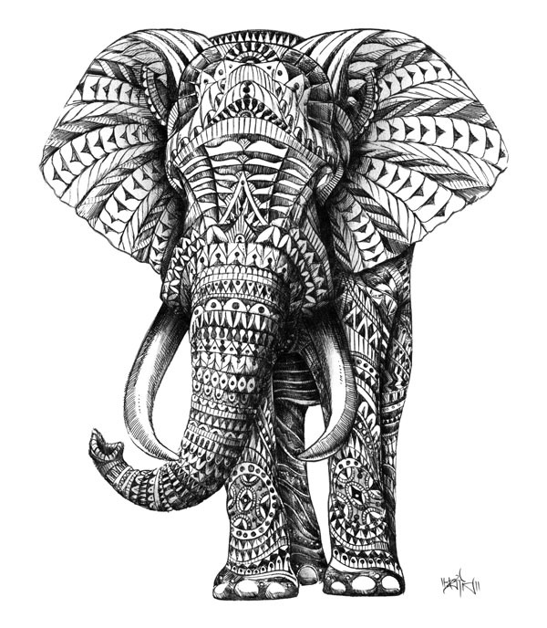


Due to the majority of my practice but made up of hand rendered imagery I like to have a look at what other people are doing within this area. Although I am not directly influenced by what I see because you don't want to copy someone's style, I find this area interesting in the same way that I do graphic art because it's quite enjoyable. Looking at these kind of works has inspired me to utilise my hand rendered style but edit this digitally because sometimes this can make a piece stand out more and is more easily editable. I like really intricate hand rendered pieces and aspire to be able to draw like this at some point in my own time.
Subscribe to:
Posts (Atom)