Tuesday 30 April 2013

Nail Varnish; Together studio.

Together are a multidisciplinary studio based in London. I found out about them via Kirsty Cave and she said they've done a range of packaging for cosmetics which links to my nail varnish brief. 


The main client linking to my brief is No7 and these are examples of the packaging they have produced. This is the sort of standard I'd like to interpret into my brief with the use of some sort of pattern as part of the design. It's a good example of how colour can be applied differently across a range so that it still all links together. The majority of No7 packaging also has some sort of finish to it but in quite a minimal way which is something I've started thinking about for my own brief anyway so at least I know I'm going in the right direction with it. 


Nail Varnish; brand development.

Photoshop edit
Because I didn't really like the scribbly bit within the font I took it into photoshop and erased this out. I tried to make the edges as neat as possible to make the live trace in illustrator neater too. 

Live traced
The first time I tried live tracing this from photoshop it came out like this with loads of gaps in. This is probably because some areas of the font are quite thin. I then went back into photoshop with the original edit and drew lines in using the paint brush where you can see gaps on the above text. 

Live traced
This is what it looked like after I'd live traced the text again so this is what I'll take forward to develop the logo properly. 


I then experimented with different colours and was quite drawn to have the logo grey because this is quite a neutral colour and I needed to choose something that is going to work on the bottles which will contain different coloured nail varnish. I also looked at adding these kind of droplet shapes into the design because it seemed quite plain and it started to work best attached to the actual logo in some way because it's quite a subtle touch but makes a difference. 

This is the logo I'm going for and the reason it's so light is because I've decided that I'm going to foil it because this will add to the quality of the packaging. Although it doesn't work as well as a flat colour on a white background, when applied to nail varnish bottles etc, this will definitely work because it will stand out off colour as seen in the development pages. I'm pleased with this because it's really femanine and quite modern considering it's so stylised. 


Monday 29 April 2013

Nail Varnish; typefaces for the brand.

Made with B
RitaSmithAlt
Fox connection

These are typefaces I've downloaded that I thought would be appropriate for my nail varnish brand. I came up with the name Jelly because actual jelly is bright, bold, and shiny and that's how I imagine this brand of nail varnish would be. I feel it's also quite a fun name and because the product would be aimed at a 16-25 audience it seems apropriate. I've gone for typefaces that are quite fun but sophisticated and I feel the target audience may also like/relate to. I quite like the top typeface for the outline style but not really the scribbly bits inside so I think I'm going to take this forward and maybe edit it more to what I'd like it to look like. 

Thursday 25 April 2013

Yearbook; image placing.


I volunteered to take on the task of placing all the images within the yearbook. This took a whole day but once I got into it, it was pretty straight forward. I had to resize each image and then crop into them so detail could be seen within the pattern designs. The name order within the yearbook had already been picked out of a hat by Sophie so I knew exactly whose work I had to place where. For the majority of the pages even though the order was completely random, the style of the work and the colours within the work seemed to compliment each other. There were a few cases however, where I had to swap people around because their work suited a square more or a rectangle, or also because certain pieces didn't work on the same page. Once I'd done this, I showed everyone else in my group and they seemed to be really happy with it. 

Yearbook; chosen images.


After the photoshoot with Jessie, I went through and chose the best image for each student to be placed within the yearbook. I tried to put all the images we took at the photoshoot into a contact sheet but because there were so many, I was unable to make one. This contact sheet shows examples of the original image and then the cropped image that I altered for the yearbook. The photoshoot was really successful because everyone brought really cool work to be photographed and the day ran smoothly with the help of our collaborative photographer Jessie Leong. Part of my job on the actual day was to write down the numbers of the photographs for each student so we didn't credit the wrong people for the work. 

Wednesday 24 April 2013

Yearbook; collecting images.


When we did the photoshoot a few of the students asked if they could also submit digital files in case these were better than the photographs, because there were only a few of these requests, we said that, that was ok. One of the students emailed me her work through and specified which piece she would like in the yearbook. 

Tuesday 23 April 2013

Yearbook; meeting.

We had a post photoshoot meeting with Duncan to discuss how it had gone and show him the changes Kirsty had made to the yearbook cover as discussed. We agreed a compramise in that we would lay the text out how Claudia had done within her design for Duncan to be able to keep the colour scheme we've been working with. 

This is what the cover looked like previously:


This is the final cover design: 


Yearbook; layout without images.


We'd already set a date for our photoshoot for the images of student work for the yearbook so we got on with the rest of the layout so that it would just be a case of placing the images. Claudia set the layout and type and fed back to the group to make sure everyone was happy with this. We then showed this to Duncan so he could see the progress we were making with the yearbook. At the moment there are grey boxes where the images will go but this shows what format those images will be in. At this point, the vast majority of the work in done on the yearbook but there could obviously be minor tweaks to do later on. 

Monday 22 April 2013

Yearbook; photoshoot.


Tigerprint colour; foiling test.


Some of the advice I got from the crit was to have a go at foiling the patterns for the Tigerprint brief to add to the quality of the product and make it a bit more exciting. I bought two different types of blue foil to see which would compliment the ink colour best and applied this to various different versions of my pattern to also see what would work best. The larger squares work really well with the foil and it doesn't neccessarily have to be neat because this also fits in with the style of the pattern design. I definitely think I'm going to take the idea of foiling the products forward but probably only the invitations and the rsvps because these are more keep sake than many of the other products within my range. 

Sunday 21 April 2013

Tigerprint Colour; invitation and rsvp.


These are the final designs for the invitation and the rsvp. They are exactly the same design but the rsvp will be smaller than the invitation so that when the invitation is posted, the rsvp and envelope can be placed inside. There is the inpracticality that the rsvp is going to be so small it could get lost in the post but I thought about the fact it coul be put inside another envelope as most people tend to have these at home. When printed, both of these will also be foiled. The insides are now both blank so that a personal message can be written inside because as a consumer of these products, I much prefer it when I can write whatever I'd like and from experience, other people do too. 

Friday 19 April 2013

Surface Pattern Yearbook; meeting.

We had a meeting today to show Duncan the current progress on the yearbook. At this point we had made decisions about the overall layout of the yearbook but just with placeholder images as an example, the front and back cover and all the copy was set within it. 

Duncan said that he had come across some development on one of our blogs and when he showed us whose this was it happened to be claudia's. Although he liked the previous colour scheme for the yearbook cover, he said he preferred the darker and bolder colours because this really stands out. 
The font we have chosen needs a donation toward it for the designer so we spoke to him about this and he's happy to do this. 
He's asked about having some hard copies printed to be placed around their studio at the show and also so we can all have a copy each. 
Duncan needs to check out a link to the course website to make sure this is ok. 
We need to print a copy of the yearbook for Duncan so he can show the rest of the course team what progress has been made. 
One student has details missing so we need to chase this up. 
We may possibly use some images Duncan has as backgrounds from awards etc. 


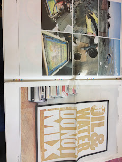
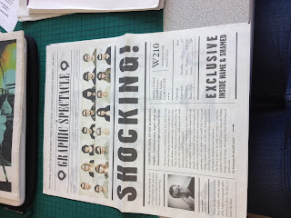
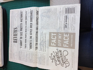
Design Context Publication; examples of newspapers.


Baljeet lent me some newspapers so I could get an idea for the format I'd like to lay my own newspaper out in. This gave me a good idea of the scale I'd be working with, how I could possibly place my own images and the point sizes I should consider using. The great thing about these newspapers was that the majority of them were image based so they were a really good source of inspiration. 

Thursday 18 April 2013

Tigerprint Colour; banner development.

Before desinging this product, I already had a typeface in mind that I thought might be appropriate because it's quite positive and bold enough to work in a banner format. 

I started off by having a going at using the repeat pattern within another product again for the same reason as with the envelopes. This idea would be that the typeface would be all in black saying 'happy birthday' on top of the repeat pattern design. I don't think this really works because the black is too harsh on top of the bright colours but if I were to change the black to orange or blue the text wouldn't be a visable. 


I then tried the idea of cutting the font out from the repeat pattern. I've tried this twice on different areas of the pattern to see if it made any difference but on both occassions it doesn't work due to the gaps in the pattern. You can just read the text but not enough to make it a good design decision. 

I thought I'd move away from the repeat pattern because this obviously isn't working for this element so I just decided to use the straight forward colours. The idea with this is that the letters would be cut out and attached to ribbon. There would be two banners with in the pack for each of the colours used in the pattern. I got this far with this idea and then decided that really it's a bit plain compared to the pattern design and theres so much more I could do with it to make it fit in. 

I then came up with the idea of going back to basics and like with the pattern, hand rendered the typeface so it has sketchy edges because this will be more consistent with what I've already designed for this range. 


I decided to apply colour in the same way that I have done with the Paperchase logo and also the invitation imagery design so that everything links together. I thought about the fact I could have a blue banner and an orange banner in this style or just a single blue and orange one. Although this is looking more like it's going in the right direction, I'm not sure about the format of the colours because some of the other elements of this project are a bit more minimal. 


I decided to go for the two seperate banners to have more products within the range and took away the colour from the inside of the text. This looks so much better because not only does it look tidier but it now fits in with the exisiting products. The idea is that I will cut the seperate letters out and attach them to ribbon for them to be hung up. I'm pleased with this as an outcome because the decisions I've made one after the other have got me here so theres definite justification. 


Yearbook; final quote typeface and layout.


I showed everyone in my team what I had been doing with the quotes and they agreed on the typeface I liked best and also the idea of having the quotes central. The one thing they did say was that I'd need to go back through and make sure the quotes read correctly in terms of the amount of text on each line etc. The other thing was to check the kerning and leading to make sure it looked right from a design prospective. Above are the quotes in the correct typeface and with all the suggested changes applied. I've quite enjoyed having this task to do because usually I don't really work with type. 

Wednesday 17 April 2013

Crit.


This was the first proper crit we've had on actual produced outcomes and I felt I had a substantial amount of work in order to get the relevent feedback I required. At this point I had products for some of my briefs and concepts set in stone for all of them as well as various design development so people could see the direction that my work is going to take. I had some specific questions I posted to people about which designs they preferred for various briefs as I'd kind of hit a brick wall with some of them. I feel overall, this crit was really useful and I got a lot out of it. The briefs I was stuck on can now be taken forward using the feedback I've been given. People also seemed to like the direction my briefs were going in so this was really good because at least I know they are working and will hopefully be successful. I filled out a sheet myself too just so I know exactly what I need to do next in order to move on with the briefs. 


Tuesday 16 April 2013

Tigerprint Colour; envelope development.


I decided to design the envelopes as part of this brief too because I thought it would be quite interesting if I could utilise the actual pattern design seeing as I spent quite a lot of time developing this. I've come up with designs where this could be applied in the center and simple full colour envelopes that match the colours used in the pattern. 


I printed a couple of mock ups out for the envelopes to see which is going to be the appropriate size for my cards and make sure the net I've been designing with works. Had to do this a couple of times before I got the right one.