


I then moved onto the gift wrap design and thought about the repeat pattern design I'd tried on the greetings card so applied this to this product instead. The water design definitely works better than the elephant and it means that the designs vary slightly from product to product instead of all literally being the same. The smaller water droplets design in particular works better because although it looks like quite a lot to see in this format, when a present is actually wrapped up and it's in context it won't appear as over powering. This kind of design also works quite well with the whole idea of the range being simplistic.


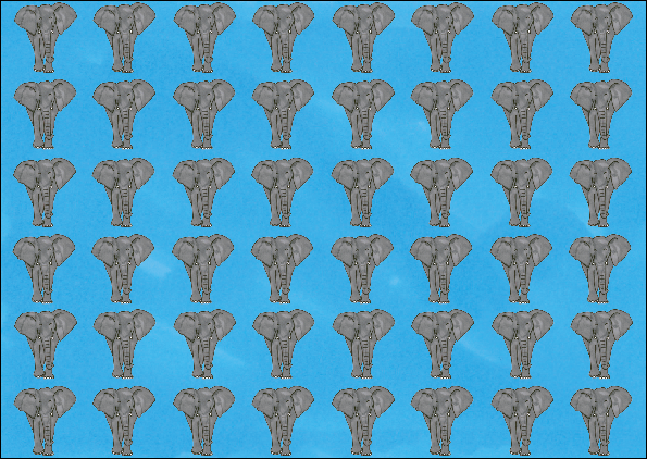
Based on my favourite design with the elephant imagery I applied the same concept to the rest of the gift wrap to match the different animal cards. I was unsure if this concept would work across everything but it really does and I'm quite pleased with it. My particular favourite is the dog bone pattern due to the constrast between the red and the white.


The way that I'd like to package the gift wrap means that they usually come in packs with two sheets. To give the consumer an option I've taken the coloured background and made this into a gift wrap design because this and the pattern should compliment each other quite well as well as working with the rest of the products.
No comments:
Post a Comment