
This is an example of the colour difference with and without the textured background to show the effectiveness of this. It definitely makes a positive difference to the design.


These are all the card designs set up ready for print and finalised.


I knew when designing the greetings cards that I wanted to keep the inside of them blank because I much prefer it when you can write a personal message as messages inside cards tends to be soppy and not applicable to what some people really want to say. I then thought to jazz the inside of the cards up, I could create an insert that matches the card design so I took the colours and part of the image to do this. I'm not sure about this full bleed colour on the inside because it could be too overpowering when printed.
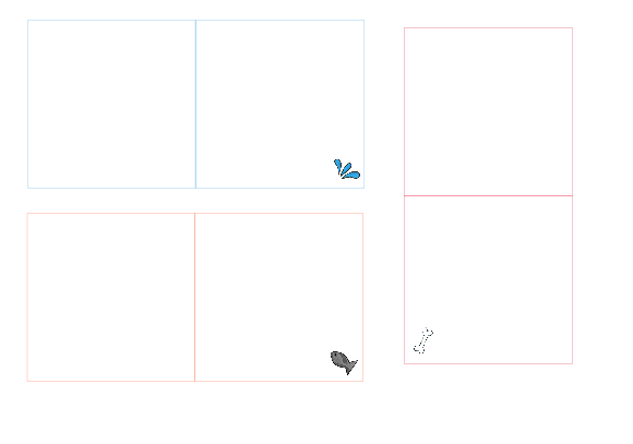

I took a more minimalistic approach to the inside of the card and this works a lot better. Although it's quite plain, the small image in the corner enhances it and once a message is written inside this won't be a problem anyway. This is the set of the designs I'll take forward for this part of the card.
No comments:
Post a Comment