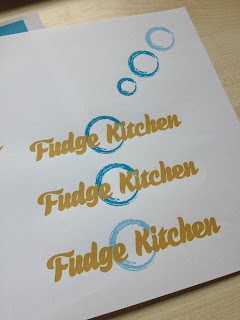
I did some test prints for the colours to see how they looked in print compared to on screen because a lot of the products for this brief are going to be print based. The idea of the blue/green colour is that no other food company has really utilised this within their branding so it would be unique to the company. The brown colour is based on fudge as this is fitting for obvious reasons. I experimented with a few different bluey/green colours to see which I liked best and how they could be applied to my products. The quality isn't fantastic from my home printer but it gives me a good idea of what I'll be working with.
With the packaging test prints I mentioned the fact I'd like to print onto this brown paper so I've tested the belly band design on this. Although the brown obviously alters the colour slightly, it still looks really good and is very fitting with the product being fudge. It also has a hand made aspect to it which is fitting with the fact the product itself is hand made.
I did a couple of foil tests to see which colour works best on the brown paper too.
I think I definitely prefer the coppery colour because this works really well on the brown paper and also links to the fact that the pot the fudge is mixed in is a copper colour. This also shows that the logo still works when it has been foiled although the quality is not perfect because I've done this by hand with a foiling pen.
As a tester I also foiled the circle in the logo but feel this doesn't work as well because it seems a bit random and breaks the logo up too much with being quite high impact.
The idea of foiling adds quality to the overall designs because this is supposed to be quite a high end product.


No comments:
Post a Comment