
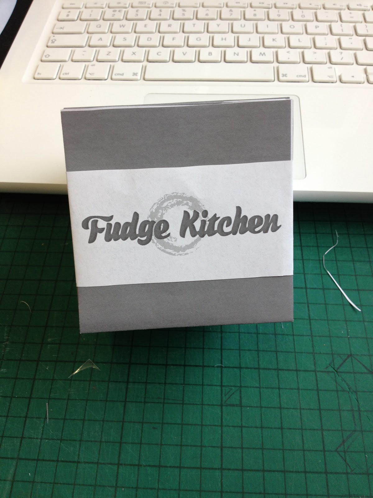


With the Fudge Kitchen packaging, I already knew vaguely what I wanted this to look like and had created some packaging very similar so was able to use the net to make this one too. The only difference between the original and this is that, that had a seperate lid where this is a flap so I had to change the net slightly. I couldn't decide whether I wanted to have the polka dots on the outside or the inside of the packaging so I did two different versions to print out to see if this could help me decide. I also printed various different types of belly band because I didn't know whether I wanted this blue to match the packaging (the dark grey on these images) or plain white. Although the net itself worked absolutely fine, I realised I'd made a mistake with the belly band design because I'd just put the logo in the middle of the strip so when I folded this up, it wouldn't be in the right place when put around the packaging. I went back and changed this and you can see how this works on some of the later images. I prefer the plain outside of the box because with the logo and the polka dot outside it seems a bit too busy. I'm also considering a different kind of stock for the belly bands to break the colour up a bit more. I think white may be too plain but I've seen some nice brown paper in the library so may have to experiment with this. I need to make a couple of different sizes of this packaging for different products so now need to set this up for print.
No comments:
Post a Comment