Showing posts with label Brief five context. Show all posts

Tuesday, 26 February 2013

YCN UK Greetings; animal illustration.

Here I was looking at how other designers and illustrators have approached illustrating animals to inspire me. 


Andreas Preis - Graphic Designer and Illustrator based in Germany.
These pieces really stood out to me due to the unique style that this designer has used. These are just three of many designs he has done with animals. I like the fact that they are almost mosaic like because within certain aspects of the animals they have a pattern. The style throughout all of these designs is consistent too because the designer has taken key aspects and applied this throughout each design. This is something I need to think about within my own practice when creating a range. 


Bioworkz - Graphic Artist and Illustrator based in the USA. 
I really like these illustrations because although the designer has used only black and white, the animals almost look as though they are coming to life due to the depth of the illustrations and the attention to detail. I particularly like the elephant for the fact the pattern within it really works and makes such a simple animal look so magestic. Dependant on the project, this set of illustrations in particular is proof that colour is not always best and design can still be as inspiring in black and white. 


Alejandro Giraldo - Graphic Designer and Illustrator based in Colombia. 
I really like this set of illustrations because the designer has taken well known animals but applied their own unique twist on this and in a way given them personalities. My favourite element about these pieces has to be the fact that the application of colour is very subtle but makes all the difference to the image. The fact all of the different characters have been put together also shows consistency in style. 

Daniel Teixeira - Illustrator and Designer based in Portugal. 
Throughout my research so far, owls seem to be consistant theme and it's been really good to see how different designers have utilised this because I am also going to be creating an owl greetings card design. I particularly like the image above because the focus is less about the actual animal within the picture and more about what can be done with it's characteristics such as the feathers. You can really see how this image may have built up and I think it's very effective despite being simplistic. It's making me consider the fact that sometimes it's better to think outside the box with illustration. 


Veronica De Fazio - Graphic Designer based in Argentina
This is another very good example of thinking outside the box because instead of this designer illustrating the literal animals, they have decided to use shape instead. This is very true to modern day design because everything seems to be quite minimal like this. I'm particularly drawn in by these designs due to the bright colouring and the fact they aren't particularly relevent to each animal in turn but you can see exactly what each animal is. The diamond shapes falling down throughout the image is a nice touch because it breaks each one up a bit too. 


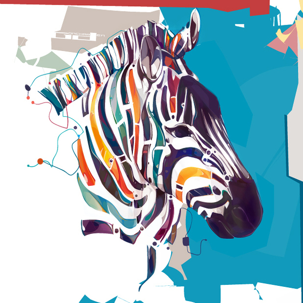
Dennis Gonchar based in Ukraine. 
More examples of minimal abstract design yet somehow these are very intricate at the same time. I was really impressed with these designs because they are completely unique to anything I've seen before. These are another series that appear to be made up of shapes but this time layered yet not as obvious unless you spend a lot of time taking them in. The random abstract backgrounds work really well here too because they fit well with the illustration style and compliment the animal wherever they have been utilised. 


MJ Da Luz - Graphic Designer and Illustrator based in Costa Rica. 
Going back to the opposite end of the scale and animals in a more literal sense. This has inspired me to consider how I can add my own twist to my illustrations. Is there something really small that ties them together? These illustrations all tie together via the fact they have an oversized head which is quite a quirky characteristic. When considering something like this I also need to think about who my target audience is going to be because to me these illustrations are aimed at a younger audience. 

YCN UK Greetings; illustration.

Here I'm looking at the different types of media I could use for my illustration and what works most effectively when edited digitally. 


Mattias Adolfsson - Illustration based in Sweden. 
This style of illustration is very similar to my own in the sense that the drawings are really simple with a black outline. The thing I liked most about this piece was that although the colouring is really simple, it has an element of depth to it with the way that it has been applied instead of being a block colour. The features on the characters are also really simple  which is something I utilise within my own design work too. 


Nicholas Kole - Illustrator and Character Designer. 
This is another set of illustrations I was really drawn to due to the application of colour and the fact the way it has been applied really brings the characters alive. Much like my own work, I also really like the fact that you can actually tell the illustrations are hand rendered and a lot of time has gone into them. I think hand rendered work like this is more personal to the illustrator. I particularly like the top image in the way that you can see a couple of stages the illustration has gone through with the line drawing and the application of colour because this really showcases the effect colour has on the work. 


Samantha Jones - Student based in South Africa. 
I was really drawn to this piece due to the use of bright bold colouring. The illustration part of this is what interestings me most and again I think a good choice of media has been applied because it almost makes the characters seem alive. The characters are meant to have a texture to them as this is what makes the whole piece more visually interesting as such a limited colour pallet has been used. I think the media is definitely what makes this piece so successful. 

Silvano Robles - Graphic Designer based in the USA. 
This is another type of illustration and again the overall look of the piece revolves around the way in which the colour was applied. Although I like this style because it creates bold pieces, I think because it doesn't have any depth to it as such, it doesn't really appeal to me as much. I do really like the fact that this piece doesn't really communicate anything as such and is just there to be enjoyed because the colours used make it visually appealing. 

Walker Ballantyne - Hill - Illustrator and Designer based in Canada. 
Another method of bringing illustrations to life is by applying shades of a particular coloured used in order to make this area appear more life like. Shading is another element that brings an image off the page and makes it more visually appealing. I really liked this piece because although the colours are quite bold and bright, they have a pastel characteristic to them which makes the overall piece appear professional. Although some of the colours contrast, they work really well together in the way in which they have been applied. 


Nicholas Mahlunge based in Brighton. 
These pieces really stood out to me because I personally like to draw everything with a black outline before adding colour or making it digital so they are definitely something I can relate to. I like the fact that line drawings like this don't always have to be completely perfect because if they are slightly imperfect then this seems to add more character to a piece. I also seem to have a big interest in pattern design at the moment so that's another reason why these pieces appeal to me. 

Friday, 25 January 2013

Print visit to Pressision.


A few of us went to visit a local printers called Pressision in order to referesh our knowledge of print but also see what they have been working on recently. It was a good opportunity to build another contact that we will more than likely need in the future. This visit was really useful because it seems like so long ago since the print module and it's good to keep these things constantly ticking over. It was also great to see what all the different machines did and the fact traditional methods are still being utilised. Everyone at the printers made us feel really welcome and were full of print knowledge that is sure to come in handy. I really enjoyed looking round and the print they produce is really impressive. This visit will inform many of my briefs because a lot of my work is print based design so it's something which I will always need to consider. 

I took a video of the printer cleaning and loading the sheets for the next print job to show how this works and what it looks like. The cool tune the printer plays was just a bonus. 

Thursday, 17 January 2013

YCN - UK Greetings: greetings cards designers.


Max Lippolis - Graphic Designer based in Italy.
I was particularly drawn to this piece of work because it stood out for the fact it doesn't fit the usual constraints of a greetings card. This has lead me to consider what I could do differently in order to stand out within a competative market for the brief. The design itself seems really simple, the concept is what makes this piece stand out. Something interactive could make my own product more desirable. 

Jack Teagle - Illustrator based in Newquay. 
Since finding this piece of work I've seen it in quite a few different places and it has not only been applied to greetings cards but products such as t-shirts too. I really like the hand rendered style of the illustration and this is something I try and incorporate into my own design work. Another thing to consider within my own designs is that if I have my own unique style, it is more likely to make the product desirable because consumers tend to look for something different. 


Kimberly Munn - Graphic Artist based in the USA. 
I really like the way these cards have been designed, using ink and stamps. The media is really important within greetings card design because it can either add to the quality of the product or hinder it. A product may also seem more high quality if it's obvious that a lot of time and consideration has gone into it and with designing something like this that is usually the case because these cards will have been hand made. Seeing these designs has also made me consider colour because sometimes a minimalistic approach can be most effective. 


Martina Friedli - Graphic Designer and Illustrator based in Switzerland. 
Again, these designs stood out to me because of their minimal colour pallet and simple hand rendered design approach. The colour considerations link to the time of year/occassion these cards have been designed for so this is something to think about when designing my own cards depending on the route I decide to go down. Something else that particularly drew me to this work was the way in which it had been photographed, on this textured wood surface. Although this doesn't link to my design approach, this is definitely something to consider for my portfolio when I come to photographing the briefs for this module. 

Laura Richardson - Designer and Illustrator based in the USA.
I really like this product range because it's bright, bold and exciting. Although the design itself is quite simplistic, the use of colour is definitely what seems to draw the eye in. I was also really drawn to this work because although the product range is based on the same animal, it differs slightly depending on what the product is. This has inspired me for my own product range because last time I did a project like this, I didn't really think about it in this sense and kept everything really uniform. I need to consider how I can use the same subject throughout the range but mix it up a bit to make it more visually engaging. 


Angela De Reis - Illustrator based in the USA.
I again, really liked this particular greetings card design due to the simplicity of the design. I was drawn to it because it would be something I'd consider purchasing for the simple fact that it has a badge and this is something the person I was giving the card to would be able to keep. Generally when consumers purchase cards, they don't tend to be kept and will eventually be thrown away so something to consider with my own designs is what can I add to them in order for someone to see them as a keep sake or just generally attract them to buy the product? A product within a product, like this badge, is a good yet simple idea because the consumer is likely to at least keep one or the other. 

Ed Miller - Illustrator and Product Designer based in New York.
I really like this range of greetings cards because the illustrations are fun and inviting and the colours used create bold design. Something else I really like about this particular piece of work is that despite all the designs having different things going on within them, they all still link together as a range due to a cotinuous illustration style. I could make my own range really interesting by utilising a method such as this so that the designs could reach a larger target audience because there would be more options available.