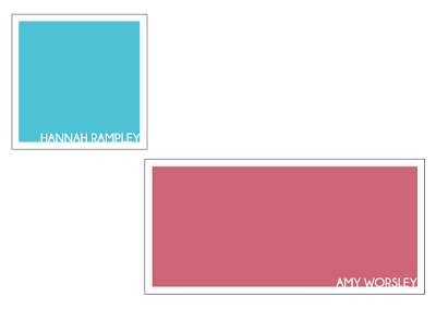
Usually at the end of year show, each student has a name card next to their work so vistors know who has designed the work. I thought it would be good to link this element to the yearbook too. Although the design is really simple, it's a nice touch to tie everything together. I tried placing the name really large in the center but this was too overpowering. Having it quite small in the corner works with the minimalistic approach to the yearbook cover and it still stands out because its white on a bright and bold background. Each students shape of their name card would be based on their shape within the actual yearbook and the colour would depend on the colour of the work they put in the show but would also be based on the colours used on the quote pages.

No comments:
Post a Comment