Showing posts with label Brief Two Context. Show all posts

Wednesday, 13 March 2013

Surface pattern yearbook; Tim Walker.


We've asked Jessie from photography to shoot the work for us and when we mentioned the idea of a scrapbook theme she suggested looking at Tim Walker because his sketch books utilise this kind of style but more in the way that we are considering and not quite as crazy as Dan Eldon. I really like the idea of mixing up the image sizes on different pages like in the examples above because this will make the whole yearbook really visually interesting. 


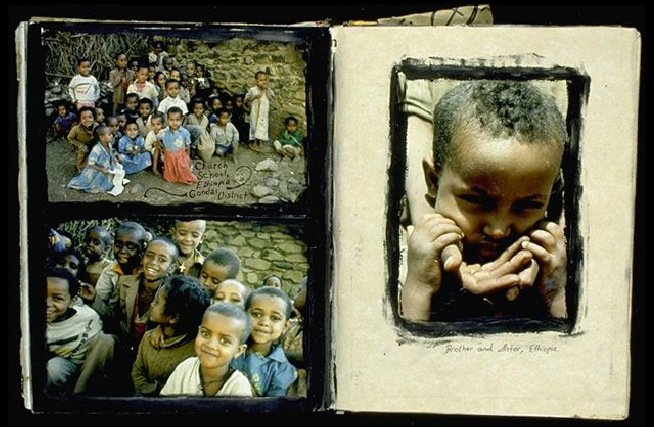
Surface pattern yearbook; Dan Eldon.


We've come up with this idea of a kind of scrapbook appearance/theme for the yearbook because Duncan talks about how they are a 'tribe' so this is quite fitting. A good example of someone who scrapbooks quite creatively is Dan Eldon so I've had a look at his work to see if I can gain any inspiration for our yearbook. Although the yearbook obviously won't be quite as crazy as some of his work, we'd like to utilise elements such as the way images are placed and want it to be quite image heavy to really push the creativity of the course. 


Friday, 25 January 2013

Print visit to Pressision.


A few of us went to visit a local printers called Pressision in order to referesh our knowledge of print but also see what they have been working on recently. It was a good opportunity to build another contact that we will more than likely need in the future. This visit was really useful because it seems like so long ago since the print module and it's good to keep these things constantly ticking over. It was also great to see what all the different machines did and the fact traditional methods are still being utilised. Everyone at the printers made us feel really welcome and were full of print knowledge that is sure to come in handy. I really enjoyed looking round and the print they produce is really impressive. This visit will inform many of my briefs because a lot of my work is print based design so it's something which I will always need to consider. 

I took a video of the printer cleaning and loading the sheets for the next print job to show how this works and what it looks like. The cool tune the printer plays was just a bonus. 

Friday, 28 December 2012

BAGD yearbook proposal; Previous yearbooks from LCA.


2009


2010


2012

I looked into the previous years yearbooks in order to see what had already been done and what we could do to be different and create a unique design. I think my favourite is definitely the 2010 one because although it still has this simple double page spread idea, they've mixed it up a bit with the layout and the fact some things are placed so that you have to turn the yearbook to one side to read it. The overall solution looks well considered and consistent throughout. Something that has been consistent throughout all the yearbooks is that a couple of colours have been chosen each time to create a kind of brand or theme. From looking at these yearbooks I've come to the conclusion that our design needs to be very content driven and asthetically simplistic. How can we work away from this normal double page spread layout that has been used throughout previous years? 

*I was unable to screeshot the 2011 yearbook as the link was broken!