Showing posts with label Brief five. Show all posts
Showing posts with label Brief five. Show all posts
Tuesday, 28 May 2013

Friday, 24 May 2013
Rewritten briefs.
As I've gone through the module some of my briefs have changed ever so slightly for various reasons. The main thing that has changed on many of them is the outcomes that I've created. The reason I've changed the outcomes has been because I felt with some briefs I was creating product for the sake of it when there was already a substantial amount so I've taken products out of the outcomes. These are my final written briefs.
Thursday, 16 May 2013
Final crit.

My current resolved work set out for the crit.


There were a few specific things I wanted to get out of this crit but it was mostly about the quality of my design boards. I wanted to know if they told the story well for someone who was looking at my projects for the first time. At this stage I knew exactly where each of my briefs were going so feedback on extension of briefs wasn't particularly relevent because there just wasn't the time for this. It was maybe good to think about how the briefs could have gone further though in other peoples opinions. The feedback I got given regarding my boards was positive in the sense that the people discussing them had never seen the work before and they understood it all. The only negative feedback I'd gotten really was to do with the fact my blog wasn't completely up to date but I knew this already despite trying to catch up in time for the crit. Overall, the crit was really useful and it was so good to see what people had been doing, everyone had some really amazing stuff!
Tuesday, 14 May 2013
YCN; edited photographs for boards.
I finally got round to editing my photos so I could put my YCN boards together properly. These are the best images from the photoshoot and I've edited the bright/contrast of the majority of the images because they were a little dark.
Wednesday, 1 May 2013
Progress surgery.
With the progress surgery I didn't really have any questions in particular about my work because I knew exactly what I needed to do to get the work done. I went through each of my briefs and took examples from them to show Phil where I'd got up to and the sort of things I was producing. There was a bit of concern about how much I still have left to do for various briefs and the fact I don't seem to be stressed about it yet. I think it's trusted that I will get everything done though in time for submission though. The main piece of advice I got was, how can I really push all of my briefs in the time I have left available to me? and also not to forget about the greater context of my briefs and how various products will exist. I know that I really need to speed up the pace after this progress surgery but I'm confident I can do it.
Wednesday, 17 April 2013
Crit.


This was the first proper crit we've had on actual produced outcomes and I felt I had a substantial amount of work in order to get the relevent feedback I required. At this point I had products for some of my briefs and concepts set in stone for all of them as well as various design development so people could see the direction that my work is going to take. I had some specific questions I posted to people about which designs they preferred for various briefs as I'd kind of hit a brick wall with some of them. I feel overall, this crit was really useful and I got a lot out of it. The briefs I was stuck on can now be taken forward using the feedback I've been given. People also seemed to like the direction my briefs were going in so this was really good because at least I know they are working and will hopefully be successful. I filled out a sheet myself too just so I know exactly what I need to do next in order to move on with the briefs.
Thursday, 21 March 2013
YCN UK Greetings; favourite images.
These are my favourite images from the YCN brief photos that I will take forward to use on my boards.
YCN UK Greetings and Emily Ward Branding; photoshoot.
I managed to get both of these briefs print finished so booked out one of the photography studios and photographed the final outcomes so I could get on with making my boards. Although I had quite a small space to work with, I'm pretty happy with how these came out because it doesn't appear that I'll have to do much editiing to these other than maybe cropping them down.
Sunday, 17 March 2013
YCN UK Greetings; gift bags.
The gift bag designs didn't take any development at all as such because they are based on the previous designs I have created for gift wrap and the greetings cards. I made these square in keeping with the elements I have already designed. I utilised the idea of repeat pattern down the sides of the bag to match the wrapping paper and then placed each animal in the same sort of position as on the card so that everything will continue to work together. I don't need to test the bag net because I've taken it from a previous project that I've used it in so I already know this works.
YCN UK Greetings; gift boxes.


(The gift tags are included on the screen shot because this is the print document)
The gift boxes were another element that were quite straight forward to design because I used the same sort of ideas as I did with the gift bag by mixing the wrapping paper and card concept for layout. The box net is also based on a box from a previous project so I know this works too.
Tuesday, 12 March 2013

YCN UK Greetings; submission boards.
These are the submission boards to send off to YCN for the competition brief. I've included both the artwork and the products because I feel the artwork is just as significant to the overall design. I've included explinations about the decisions I've made for various elements too so that someone can look at this for the first time and see where I am coming from.
Monday, 11 March 2013
YCN UK Greetings; chosen card photographs.
These are the photographs I've chosen to be included on my design boards for the YCN submission. Once I edited the images on photoshop they looked a lot better and I'm really pleased with how the colours on the cards have come out because I didn't want the photography to hinder this quality.
YCN UK Greetings; card photographs.
I got the cards printed for this brief before any of the other elements because the YCN deadline just required the card design so I wanted to photograph them. I set up a mini lighting studio within the graphic design studio and I was actually really pleased with the quality of the images. Although they appear slightly yellowly, I'll easily be able to edit this on photoshop. I took quite a few photographs of the cards in different ways and various details so that I have options when it comes to making my boards and can showcase every detail.
Wednesday, 6 March 2013
YCN UK Greetings; test prints.


I did a mock up of one of the card designs to see how the coloured insert would look when printed just to make sure the minimalistic approach was the best decision. Although it does work in some ways, I feel that once someone writes their message inside it, it will be quite hard to read so a white background is definitely the better option.


I printed the gift tags to make sure the colour is consistent with the cards and also to see if the size I have designed them at is approriate. I think this works because it's just the right size to include a personal message on.

I've also printed the gift wrap again to check colour consistency and make sure these designs work when they are printed before printing the final outcomes. Although this is not the size they would actually be printed I can still see that they work and that the imagery is just the right size on the repeat pattern design. This was also a good time to see that the plainer gift wrap worked with the pattern it would be packaged with.
Tuesday, 5 March 2013
YCN UK Greetings; wrapping paper.


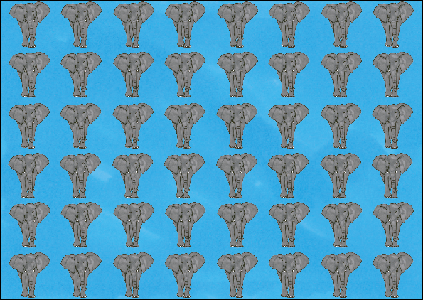
I then moved onto the gift wrap design and thought about the repeat pattern design I'd tried on the greetings card so applied this to this product instead. The water design definitely works better than the elephant and it means that the designs vary slightly from product to product instead of all literally being the same. The smaller water droplets design in particular works better because although it looks like quite a lot to see in this format, when a present is actually wrapped up and it's in context it won't appear as over powering. This kind of design also works quite well with the whole idea of the range being simplistic.


Based on my favourite design with the elephant imagery I applied the same concept to the rest of the gift wrap to match the different animal cards. I was unsure if this concept would work across everything but it really does and I'm quite pleased with it. My particular favourite is the dog bone pattern due to the constrast between the red and the white.


The way that I'd like to package the gift wrap means that they usually come in packs with two sheets. To give the consumer an option I've taken the coloured background and made this into a gift wrap design because this and the pattern should compliment each other quite well as well as working with the rest of the products.
YCN UK Greetings; gift tags.
Based on the cards, I now had a format for the rest of the products that I've proposed for the brief so these would come together quite easily without much development needed.


Because I've chosen to extend the brief beyond the greetings cards that UK Greetings require I've decided to design a whole product range for the gift industry. Above I've looked at various elements I could utilise from the card to make a gift tag. Using the animal as a shape was an option but with this you couldn't really use the other part of the imagery that goes with it so it looks a bit plain on it's own. To improve on this I looked at placing the animal within a shape using the same background as the cards. Although a circle works, I thought using a square would probably be better because this links back to the cards again. This is definitely my favourite design because it can include all of the imagery and has a reason as to why I've made the design decision.
YCN UK Greetings; cards.

This is an example of the colour difference with and without the textured background to show the effectiveness of this. It definitely makes a positive difference to the design.


These are all the card designs set up ready for print and finalised.


I knew when designing the greetings cards that I wanted to keep the inside of them blank because I much prefer it when you can write a personal message as messages inside cards tends to be soppy and not applicable to what some people really want to say. I then thought to jazz the inside of the cards up, I could create an insert that matches the card design so I took the colours and part of the image to do this. I'm not sure about this full bleed colour on the inside because it could be too overpowering when printed.
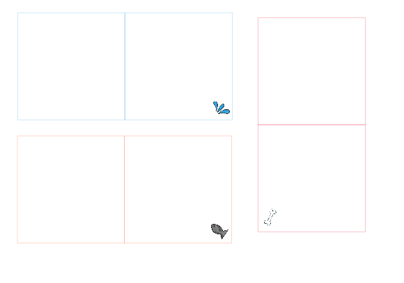

I took a more minimalistic approach to the inside of the card and this works a lot better. Although it's quite plain, the small image in the corner enhances it and once a message is written inside this won't be a problem anyway. This is the set of the designs I'll take forward for this part of the card.
Subscribe to:
Posts (Atom)