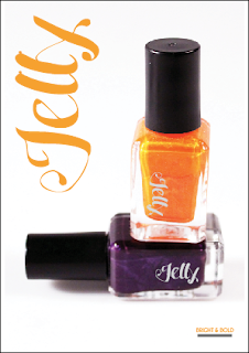
Initially these are the photographs I thought I would take forward for my adverts. Once I edited them I was really pleased with the quality of the images because the background is almost perfect white. The other reason I was pleased is because I don't have much experience in photographing glass objects.
However, when I looked through my photos again, I found the one on the far left so I've decided to use this one too. I applied the logo to all of the bottles to make it seem like it's actually a branded product and to be as realistic as possible. This now shows the effectiveness of the logo because it works on a range of different colours. I've gone for a really simple central layout for all of the images because it can be applied to all of them so keeps the designs consistent. I also quite like the fact there's a lot of white space around the image because the bright colours of the nail varnish draw the eye in. The reason for having the logo in orange too is because this ties in with the orange nail varnish in each of the images and is an alternative to having it foiled because grey doesn't stand out. Depending on the colours of the nail varnish being advertised, this would be changed to suit.
----------
I then started experimenting with the layout of the text I'm going to include on the adverts but only on two of the images because the third is the same as one of the others so the development would be very similar. I'm only including the logo, the caption and the website for this because with it being a teaser ad the idea is that people will hopefully go and investigate further into this product. This was also the point where I came up with the caption for the product and this is based on the description I gave earlier for why I chose the name, because jelly is bright and bold in colour usually. Some of these layouts don't really work because they are quite unbalanced but there are a few that do that I will take forward.
----------


No comments:
Post a Comment