Tuesday, 28 May 2013

Monday, 27 May 2013
FMP Notes.
Brief one, seven and four are all contained within the same submission box.
Design context, brief five and brief three are all contained within the same submission box.
Brief six is contained within the same folder as the submission boards.
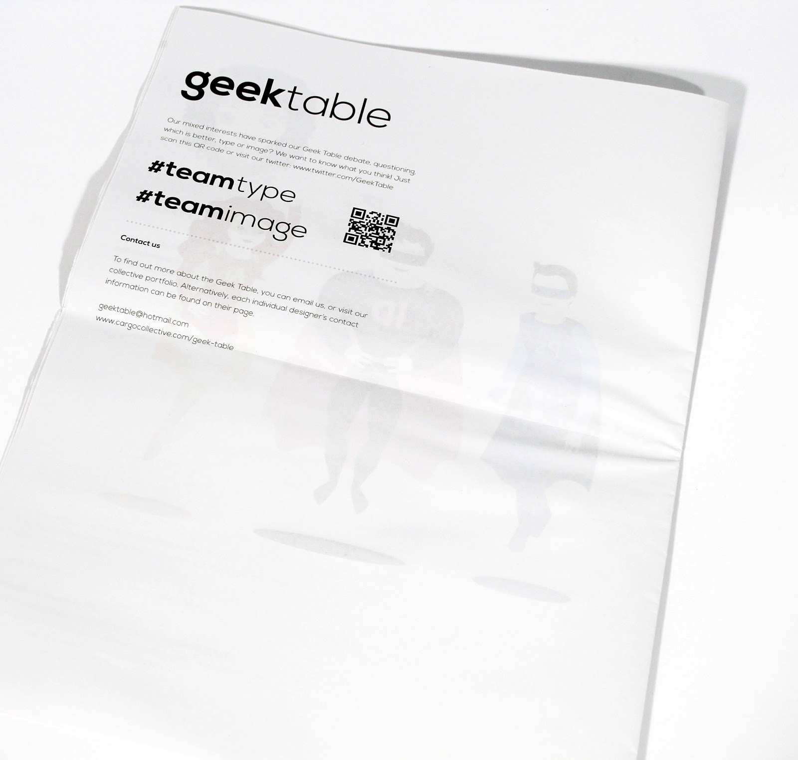
Geek Table; printed pieces.


Printed Geek Table final pieces.
The back of the postcards have the geek table logo and my geeky skill name so I can be distinguished from everyone else in the geek table but these pieces can still be linked to this particular brief and collective. I've duplexed the postcards so that they feel high quality. The great thing about them is they would be easy enough to post out and work well because people like to recieving something physical and tactile.
Saturday, 25 May 2013
Design Context Publication; bibliography.
This is the bibliography for all of the research into designers I did for my design context publication.
Geek Table; Reworked pieces.
I've been meaning to edit my Geek Table pieces based on the feedback I was given in our crits and I've finally gotten round to it! The pieces haven't changed massively in themselves but the context of them has. I decided to create postcards instead because the original purpose of having large scale prints was for the exhibition but obviously we aren't doing this anymore. The postcards can be used a promotional tool for my skill within the geek table as the overall brief is partly about promoting our skills. I think this format suits my pieces much better because when I drew the original artwork, I did this quite small so by having smaller outcomes, you don't lose any of the detail and they feel more apropriate. I'm going to print them onto watercolour card because this fits with the fact that my pieces are hand rendered.
Friday, 24 May 2013
Rewritten briefs.
As I've gone through the module some of my briefs have changed ever so slightly for various reasons. The main thing that has changed on many of them is the outcomes that I've created. The reason I've changed the outcomes has been because I felt with some briefs I was creating product for the sake of it when there was already a substantial amount so I've taken products out of the outcomes. These are my final written briefs.
Emily Ward Branding; presentation.

When I had my tutorial with Fred, he advised that I come up with a creative way of submitting the branding. I spoke to Emily about this to see if she could come up with anything that linked to her practice and she said what about framing it seeing as this links to being a curator. The frame itself is quite large but the overall idea works really well, especially the gold frame because this suits the colours of the images on the business cards.




Fudge Kitchen; photoshoot edits.


These are the edited photos for the Fudge Kitchen submission boards.
Fudge Kitchen; belly bands.
In the end when it came to actually printing the belly bands to go around the final pieces, I didn't like how they were looking so I ended up improvising and using some copper coloured ribbon to go around the sides of the box and then using the center of the belly band in the same format as the stickers I designed. This was a bit of a gamble at this stage but it actually worked so much better than I could have imagined. The images on the above post will show exactly what I mean in terms of this change!
Subscribe to:
Posts (Atom)