Thursday, 31 January 2013

Fedrigoni Acroprint White Lies exhibition.


A group of us also went to the White Lies on Acroprint Fedrigoni exhibition at Leeds Gallery in order to further explore print on top of the print visit. This exhibition showcased a new paper range but quite cleverly with design applied to it using a quote concept. Visting this exhibition gave us the opportunity to make further creative contacts but also explore different stocks due to the elements that were displayed such as various publications. This gave us ideas for the exhibition the Geek Table is planning in terms of how the work could be displayed because the space was very minimal but this really benefitted the work. 


We were all able to pick up some cheeky samples to add to our personal collections too which I'm sure will come in handy for inspiration. 


Wednesday, 30 January 2013

Fudge Kitchen; font consideration for re-brand.


These are the fonts I've found online as a starting point for the Fudge Kitchen branding that I will then manipulate somehow to make a bespoke logo. I've chosen fonts that I feel have the sophisticated edge that the company values seem to present and also ones that I feel link to the product in the way that they communicate visually. All the fonts are quite different but I want to try a range of different things in order to get the best result. 


Tuesday, 29 January 2013

Emily Ward Branding.


Arranging my first meeting with Emily so we can discuss stock options and everything she needs to consider for her branding, the print cost and print options. 


Monday, 28 January 2013

Geek Table: third meeting.

After the last meeting we all decided we would go away and have a go at coming up with a logo design. The few designs I came up with are pictured above. I tried to utilise a 'geeky' yet modern font in order to communicate who we are. 
At this meeting we all brought our ideas together for the branding for our collective. We've made a few decisions about what we are going to go with. We're going with the typeface/design that Beth has used which was a mixture of nexa bold and light. We are also going to use Kirsty C's glasses design that she came up with as part of her logo development so that if the text logo isn't always relevant, we have another option. Someone suggested considering a spot colour for the glasses design to make it stand out. After my tutorial with Phil he suggested getting my friend Emily involved in the exhibition side of things as she wants to become a curator and I posed this to the Geek Table, everyone seemed pleased to go with that idea. We all need to consider the concept for the exhibition, could we pose a question as the theme? 

Friday, 25 January 2013

Print visit to Pressision.


A few of us went to visit a local printers called Pressision in order to referesh our knowledge of print but also see what they have been working on recently. It was a good opportunity to build another contact that we will more than likely need in the future. This visit was really useful because it seems like so long ago since the print module and it's good to keep these things constantly ticking over. It was also great to see what all the different machines did and the fact traditional methods are still being utilised. Everyone at the printers made us feel really welcome and were full of print knowledge that is sure to come in handy. I really enjoyed looking round and the print they produce is really impressive. This visit will inform many of my briefs because a lot of my work is print based design so it's something which I will always need to consider. 

I took a video of the printer cleaning and loading the sheets for the next print job to show how this works and what it looks like. The cool tune the printer plays was just a bonus. 

Wednesday, 23 January 2013

Emily Ward Branding.

Emily's response to my first email asking for details of anything she already had in mind in terms of her business card and also the relevent details that need to be put on there so that I can start designing and coming up with some ideas to feed back to her. This was also the first time I'd properly seen Emily's work so this should hopefully inspire me to be quite creative with the design of the business card. 


Refined proposal form.


Based on the fact I have decided to drop one of my briefs, I have also rewritten my proposal form to fit these changes. 

YCN: Reading and Leeds Festival.

Initially I was quite excited about this brief because I've been to Leeds Festival before so thought it would be perfect as i'm the target audience they would like you to aim the campaign at. After really thinking about this brief I have decided I'm going to drop it because although it is relevent to my professional practice, there are other briefs that are more so relevent. I already feel less excited about this brief and this is even before I have started it so I feel I should find something more relevent to my interests within design because this is very digital based and i'm a print based designer. I'm not concerned because I'm already undergoing a different YCN brief. 

Emily Ward: first point of contact.

As a starting point for the branding brief, I emailed Emily a copy of the brief to make sure I was covering all areas she needed as part of her branding and I also gave her a couple of lists of things to consider so I could begin creating some designs based on what she would like and also so she knew what her options were in terms of the brief. 


Tuesday, 22 January 2013

Geek Table: second meeting.

- 18th February start the first brief. 
- A brief every two weeks.
- Six briefs between now and the deadline.
- Our show to promote us instead of people who are out in industry. 
- Possibly 13th - 31st May with five briefs (if at Leeds College of Art)
- Tumblr as our website
- Need and email, twitter etc. as a form of contact
- Possibly each have our own business card branded for the collective
- If we had the exhibition at White Cloth gallery this may target professionals better.
- Invitations to be sent to professionals
- If the event is held at white cloth gallery we could do the 10th - 17th May. 

Briefs
- Possibly choose a word and then respond. 
- Don't go over A1 size.
- Response is not limited so could be photography etc.

We need to go away and come up with some brand ideas for the collective and then bring these back together on the following Monday to decide who should develop this further. 

Monday, 21 January 2013

Additional brief: branding.


As an additional brief I am going to be doing some branding for an Artist and Curator. This will involve stationery elements as well as a logo. 

Friday, 18 January 2013

Week by week timetable.


I drew myself up a timetable so that I'm not trying to do everything all at once and can hopefully keep on top of my workload. I've left space for catch up because its inevitable that I will fall slightly behind at some point on at least one brief and this also allows time for things to go wrong. This timetable should keep me organised and I should always know what I'm doing in terms of my briefs! 


Yearbook: post pitch meeting.

There are three different options avaliable to each course requesting a yearbook, 
Option one: full print edition - 500 copies
Option two: low budget booklet/fold out (possibly PDF version too)
Option three: PDF digital booklet
All of the print options will end up being a PDF anyway for the purpose of the website. 
Programmes wanting option three may also opt for option two as a low run print option. 

The LCA logo needs to be center on the back page on any print based versions. 
Information on the spine needs to go bottom to top.
Be aware of how chosen colours fit with the rest of the college branding. 
Last page of each yearbook should be left for college information. 
Before we start designing we need all the body copy from each course. 
We need to have regular meetings with whichever programme yearbook team we get. 
Consider what is affordable, steer clear of high spec print processes. 

Thursday, 17 January 2013

YCN - UK Greetings: greetings cards designers.


Max Lippolis - Graphic Designer based in Italy.
I was particularly drawn to this piece of work because it stood out for the fact it doesn't fit the usual constraints of a greetings card. This has lead me to consider what I could do differently in order to stand out within a competative market for the brief. The design itself seems really simple, the concept is what makes this piece stand out. Something interactive could make my own product more desirable. 

Jack Teagle - Illustrator based in Newquay. 
Since finding this piece of work I've seen it in quite a few different places and it has not only been applied to greetings cards but products such as t-shirts too. I really like the hand rendered style of the illustration and this is something I try and incorporate into my own design work. Another thing to consider within my own designs is that if I have my own unique style, it is more likely to make the product desirable because consumers tend to look for something different. 


Kimberly Munn - Graphic Artist based in the USA. 
I really like the way these cards have been designed, using ink and stamps. The media is really important within greetings card design because it can either add to the quality of the product or hinder it. A product may also seem more high quality if it's obvious that a lot of time and consideration has gone into it and with designing something like this that is usually the case because these cards will have been hand made. Seeing these designs has also made me consider colour because sometimes a minimalistic approach can be most effective. 


Martina Friedli - Graphic Designer and Illustrator based in Switzerland. 
Again, these designs stood out to me because of their minimal colour pallet and simple hand rendered design approach. The colour considerations link to the time of year/occassion these cards have been designed for so this is something to think about when designing my own cards depending on the route I decide to go down. Something else that particularly drew me to this work was the way in which it had been photographed, on this textured wood surface. Although this doesn't link to my design approach, this is definitely something to consider for my portfolio when I come to photographing the briefs for this module. 

Laura Richardson - Designer and Illustrator based in the USA.
I really like this product range because it's bright, bold and exciting. Although the design itself is quite simplistic, the use of colour is definitely what seems to draw the eye in. I was also really drawn to this work because although the product range is based on the same animal, it differs slightly depending on what the product is. This has inspired me for my own product range because last time I did a project like this, I didn't really think about it in this sense and kept everything really uniform. I need to consider how I can use the same subject throughout the range but mix it up a bit to make it more visually engaging. 


Angela De Reis - Illustrator based in the USA.
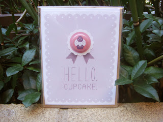
I again, really liked this particular greetings card design due to the simplicity of the design. I was drawn to it because it would be something I'd consider purchasing for the simple fact that it has a badge and this is something the person I was giving the card to would be able to keep. Generally when consumers purchase cards, they don't tend to be kept and will eventually be thrown away so something to consider with my own designs is what can I add to them in order for someone to see them as a keep sake or just generally attract them to buy the product? A product within a product, like this badge, is a good yet simple idea because the consumer is likely to at least keep one or the other. 

Ed Miller - Illustrator and Product Designer based in New York.
I really like this range of greetings cards because the illustrations are fun and inviting and the colours used create bold design. Something else I really like about this particular piece of work is that despite all the designs having different things going on within them, they all still link together as a range due to a cotinuous illustration style. I could make my own range really interesting by utilising a method such as this so that the designs could reach a larger target audience because there would be more options available. 


YCN - UK Greetings.


I then thought because I'm designing for UK Greetings, they will obviously want a unique concept and style from each submission but how can I still fit within their brand? The brand has various other card brands within it and each has a different style. In a way this gives me a constraint to work to but still leaves the brief very open.